FREE SHIPPING ON ORDERS ABOVE $99
 SAFE AND SECURE
-
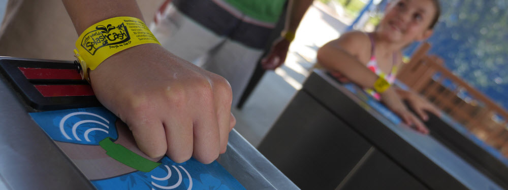
5 Ways RFID Wristbands Help Amusement Parks Manage Guests October 12, 2018
-

How RFID Wristbands Work, Decoded June 05, 2017
-
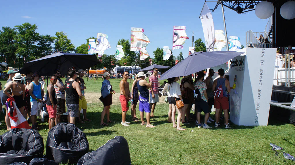
3 Benefits of Using RFID Wristbands for Real-Time Data Capture at Music Festivals June 10, 2021
-

Four Ways Thermal Wristbands Make Your Life Easier April 08, 2019
-
Top 4 Reasons to Choose Plastic Wristbands for Your Venue October 21, 2020


7 Tips for Designing Your New Custom Wristbands
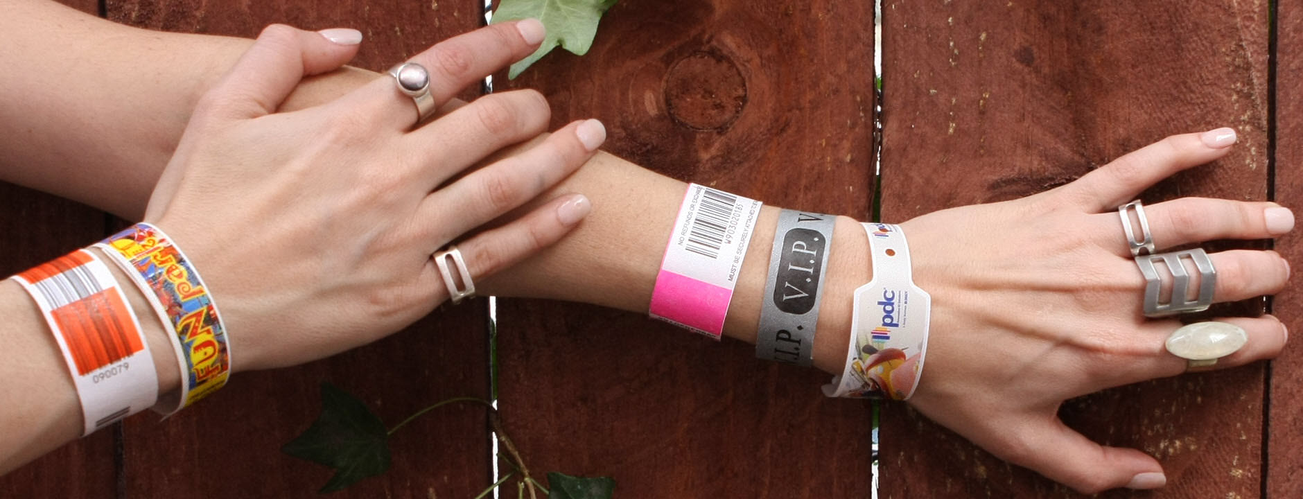
Custom wristbands make for great branding and marketing tools, especially when they feature your logo and messaging right on front. But is your wristband’s design optimal for maximum impact and visibility? We’ve discussed custom printing wristbands previously, but for this article we focus more on the design side. To help you translate your idea into an amazing event wristband, we offer the tips below.
1. Keep it Simple
For maximum visibility, keep the design simple. For an over-21 wristband for instance, avoid combining words and logos too much. When you overlay text on top of an image, the result is a design that can look too busy, making it hard for your staff to know what the wristband says from a distance. So while the final design may look amazing, it may defeat the purpose of the wristbands.
2. High Contrast Helps
Speaking of visibility, contrast also matters. Imagine reading bright orange text on top of a bright yellow background. You’ll find it isn’t easy. There’s a reason why so many movie posters predominantly feature orange and blue, two highly contrasting colors. For wristbands, make your design high contrast to help make it more easily visible. If you have a fluorescent yellow wristband for instance, use black or any other dark color for text.
3. Avoid Small and Thin Fonts
Text on a computer screen may not always appear as intended when printed. First, there are limits to how small and thin you can make text and still have it be easily visible. Second, from a hardware perspective, printers have a limit on how fine they can print. In general, avoid using a point-size 6 or smaller font since text that size becomes hard to read on a wristband.
When it comes to woven wristbands, font size and thickness especially matter because the threads used to make the bands are several pixels thick themselves. Cursive and script fonts are generally discouraged since they incorporate ultra-fine lines that mimic handwriting. Instead, use a thick Sans Serif font like this party wristband to ensure yours are easy to spot from a distance.
4. Stay Away From Web Quality Images
If you want to use photos or images on your wristband, make sure they are at least 300 dpi. In general, avoid using images you find on the web or clip art included with any program. Web images typically come in at 72 dpi, far short of the recommended 300. While you don’t need to have a raw image, you can never have too much detail.
5. Stick With a Color Scheme
When designing an event wristband, try to match your event’s color scheme. If you go overboard with colors, the design can look muddy, and if the colors are too dark, the text becomes hard to read. Generally, if it is hard to read on your computer screen, it is hard to read in person. If you’re not sure or have doubts about a design, print out your design and put it on a wall to see if you can read it.
For some wristband styles, such as woven wristbands, be aware how many colors are supported. Woven wristbands in particular support up to eight Pantone colors. However, our dye sublimation smooth wristbands can print unlimited colors to match your design.
6. Be Aware of Color Profiles
It’s easy to assume a printed photo or image will look exactly the same as it does on a computer screen, however sometimes colors may slightly shift when printed. Something that appears to be bright red on a computer screen may be printed as a slightly darker shade.
Printers typically print using cyan, magenta, yellow, and black (CMYK) ink, while your image editor may be using a red, green, blue (RGB) color profile. When a printer sees a RGB image, it will convert the image to CMYK, which may shift the colors slightly. On top of that, the monitor you’re using may not be properly calibrated, which further shifts the perceived color.
7. Use Templates
Not sure how to implement your logo or design onto a wristband? We have wristband templates available for download, so that you can design the perfect custom wristband. The templates have clearly marked imprint areas letting you know whether your design will fit on the band.